


Snack Media | Full Rebrand
In the age of fake news, integrity is everything.
Accelerating the growth of one of sports media’s most ambitious players, with a new story rooted in truth, trust and transparency.
Value Proposition & Storytelling.
Brand Messaging.
Visual Identity & Brand Assets.
Art Direction.
Design: Rob Hand (In-House).
Toolkit Creation.
Ongoing oversight of roll out.

Context.
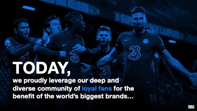
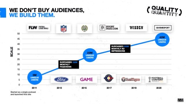
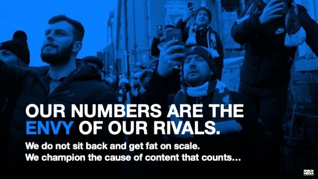
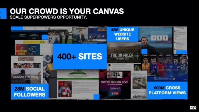
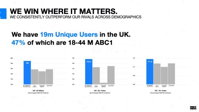
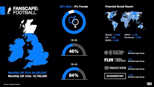
Snack Media owns and operates a global portfolio of over 400 sports websites and social communities with over 42 million unique users and 28 million followers. The acquisition of Give Me Sport made Snack Media the most-followed sports publisher on Facebook and was set to propel the business’s profile, creating the perfect opportunity for a full brand review. Internal and external research revealed two critical insights: one, that the media industry is riddled with dubious claims of reach and scale and two, that Snack Media’s clients place great trust in the business. Trust, integrity and loyalty became the foundations on which the new brand positioning would be built.


Snack Media’s True Story.
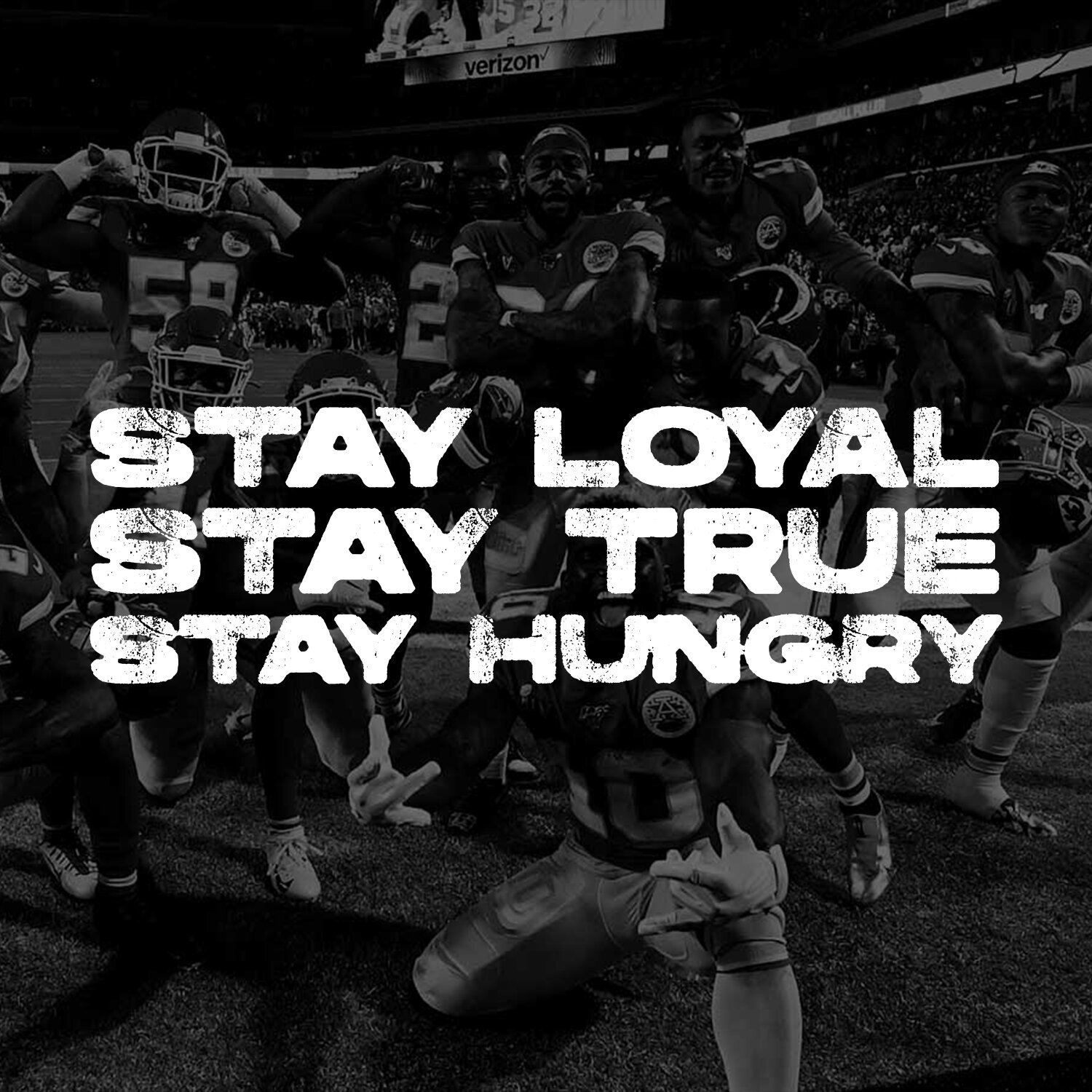
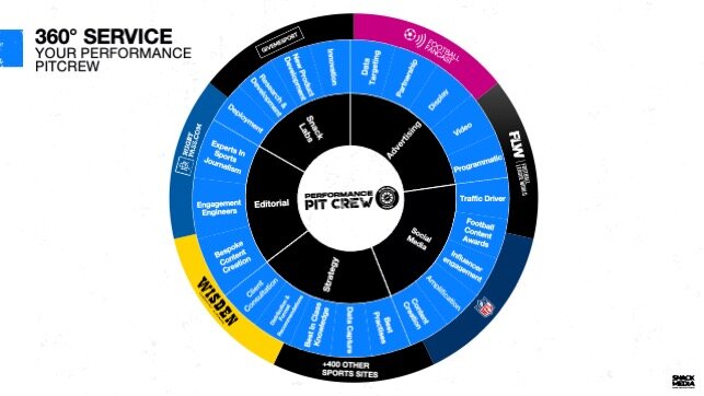
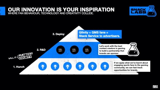
At the heart of Snack Media’s new story is the call-to-arms to ‘Honour The Fan’ with journalism that is honest, enlightening and respectful of the audience. A new set of values - Stay True, Stay Loyal, Stay Hungry - was created to help Snack Media’s people Honour The Fan and to help articulate the merits of the business to investors and partners, including NFL, WWE, Facebook and Mediacom. By staying true to these values, Snack Media ’’Make Content Count’ not just in scale, but in quality, with newly prioritised innovation projects nurtured in SnackLabs. The story goes a little deeper: The business not only produces high-integrity content, it champions integrity across the media industry with a friendly form of activism called ‘Snacktivism’. Snacktivism is a big-picture barometer, elevating it’s purpose and coming to life through everything from a line in a press release to talent recruitment.
The activism aesthetic became the inspiration for the new visual identity, with bold graffitied statements and a placard look and feel running through all of Snack Media’s comms. A new brand vernacular was developed and deployed using ‘stickers’ that Snack Media’s sales people and creative teams drop into pitches and marketing materials to bring energy and clarity. The overall feeling is one of authenticity, strength and purpose.
Impact.
The new visual identity and Content That Counts story was rolled out quickly across a new range of creds decks, sales tools, pitch documents, social media promotions and the Snack Media web site. The newly defined values and Snacktivism are helping the business write press releases and investor materials that are single-minded and strong. There has been a cumulative impact from the roll out of the new story across multiple channels. Snack Media has attracted growing interest from the US, recently winning WWE as a new client and has seen investor interest in the business increase dramatically.