Flusso | Brand Identity & Storytelling.
From Cambridge spin-out to global standout.
A story of epic engineering at massive scale.
Value Proposition & Story.
Verbal Identity.
Brand Language & Copywriting.
Visual Identity. (Crush)
Web Content & Design.
Web Build (In-house)
Context.
Flusso makes tiny, beautifully-engineered sensors that regulate the pressure and flow of gases inside a massive range of devices, from vacuum cleaners and asthma inhalers to wind turbines and server cooling systems. The business was at that wonderful point in its journey when it was time to ‘level up’ and take its well-earned place on the global engineering and manufacturing stage. This evolution from R&D spin-out to serious global supplier demanded a new brand that would light the way for Flusso’s future. 17days was invited to create a new verbal and visual identity that would secure the trust of a customer base that value quality and reliability above all else.


Flusso’s True Story.
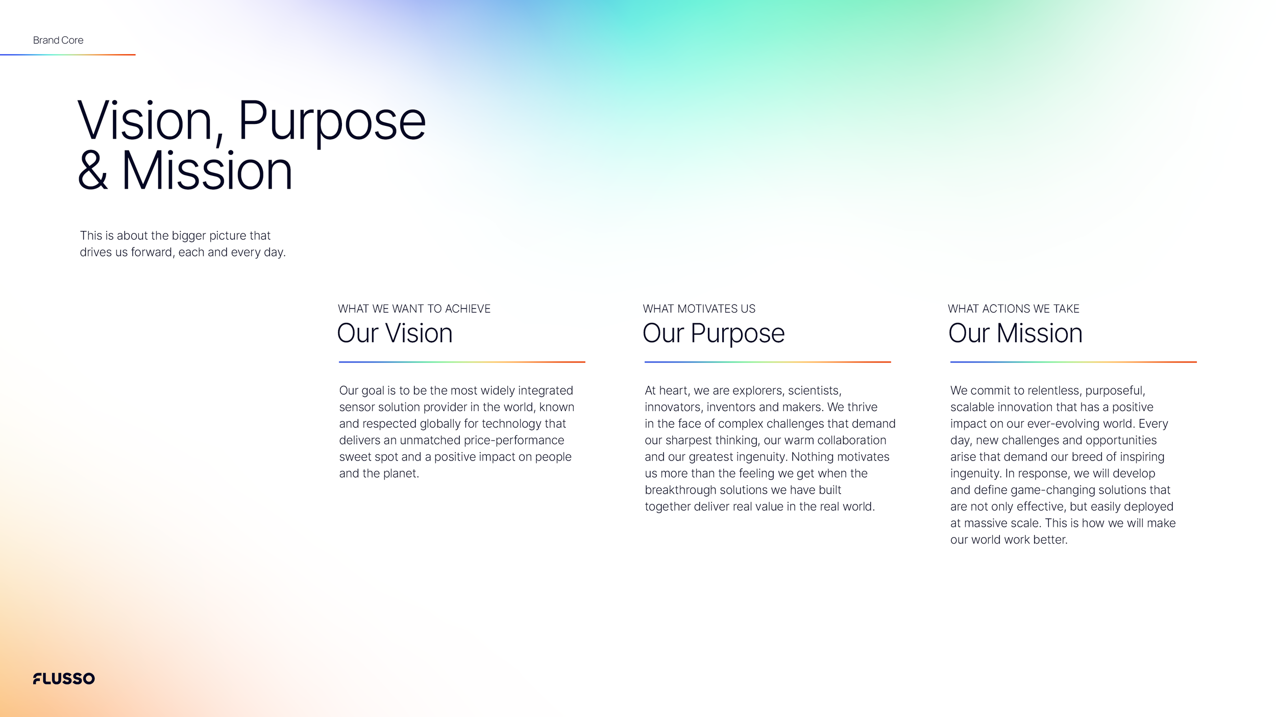
A series of leadership workshops and deep stakeholder interviews helped clarify the two key pillars of Flusso’s new story: Firstly, this would be a brand built on a culture of passionate innovation. Flusso’s brilliant people would be at the heart of the brand’s story, bringing authenticity to the company’s proprietary technology and supporting the recruitment of top talent into a fast-growing business. Secondly, it was vital that Flusso led with a confident commitment to delivering sensors at massive scale and at a price point that made product and procurement teams’ decision easy.
These commercial insights led to a range of killer phrases and passages of copy that could be easily picked up by the sales and marketing team. Sometimes the story might be more value-based, tapping into how Flusso’s sensors make the world work better, from micro product performance to macro environmental impact. Other times, the story would be more practical, calling out the super-scalability of Flusso’s sensors, and the unique Tungsten-based technology within them. We productised this technology with the name ‘T-MEMS’, enabling the business to own it, elevate it and celebrate it.
Underpinning this, we defined the spirit of relentless innovation within Flusso as ‘Lab74’. Tungsten’s number on the periodic table of elements is 74, and it is in this Lab that Flusso’s ambitious minds would continue to explore and advance Flusso’s sensor solutions. The essence of the brand - Make It Work Better - would be a daily reminder of the fundamental purpose of the company, every day.
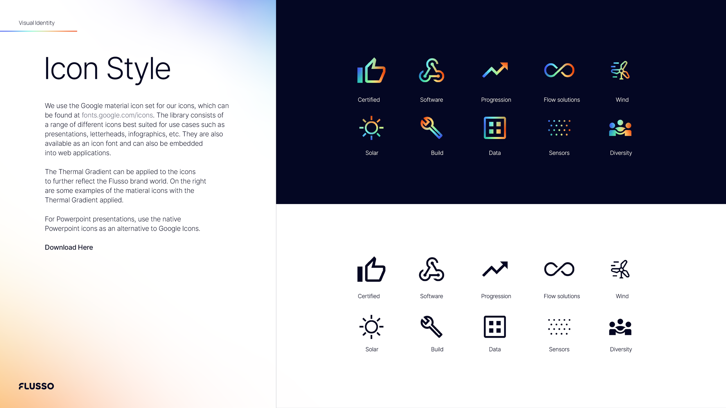
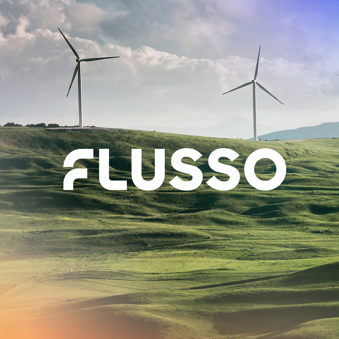
Visually, a deep understanding of the technology (so often neglected in branding projects!) led us to a thermal gradient that would flow through the Flusso visual identity, highlighting important elements and contrasting a solid, deep blue backdrop. With the addition of a mature, welcoming brand logomark and flexible graphic system, 17days created a toolkit that powers a visual identity that looks and feels ‘big’, mature and reliable.


Impact
The new Flusso visual and verbal identity are rolling out across all comms touch points, from new website and technical documents to interior design and film content. This particular brand identity has layers built in that will enable the brand to evolve and ‘play’ as the business grows more and more comfortable and confident with the new toolkit.