


Maverix | Naming, Brand Storytelling & Visual Identity.
The art of disruption.
Putting creativity, innovation and joy back into the wealth management marketplace.
Brand Naming.
Value Proposition & Storytelling.
Verbal Identity.
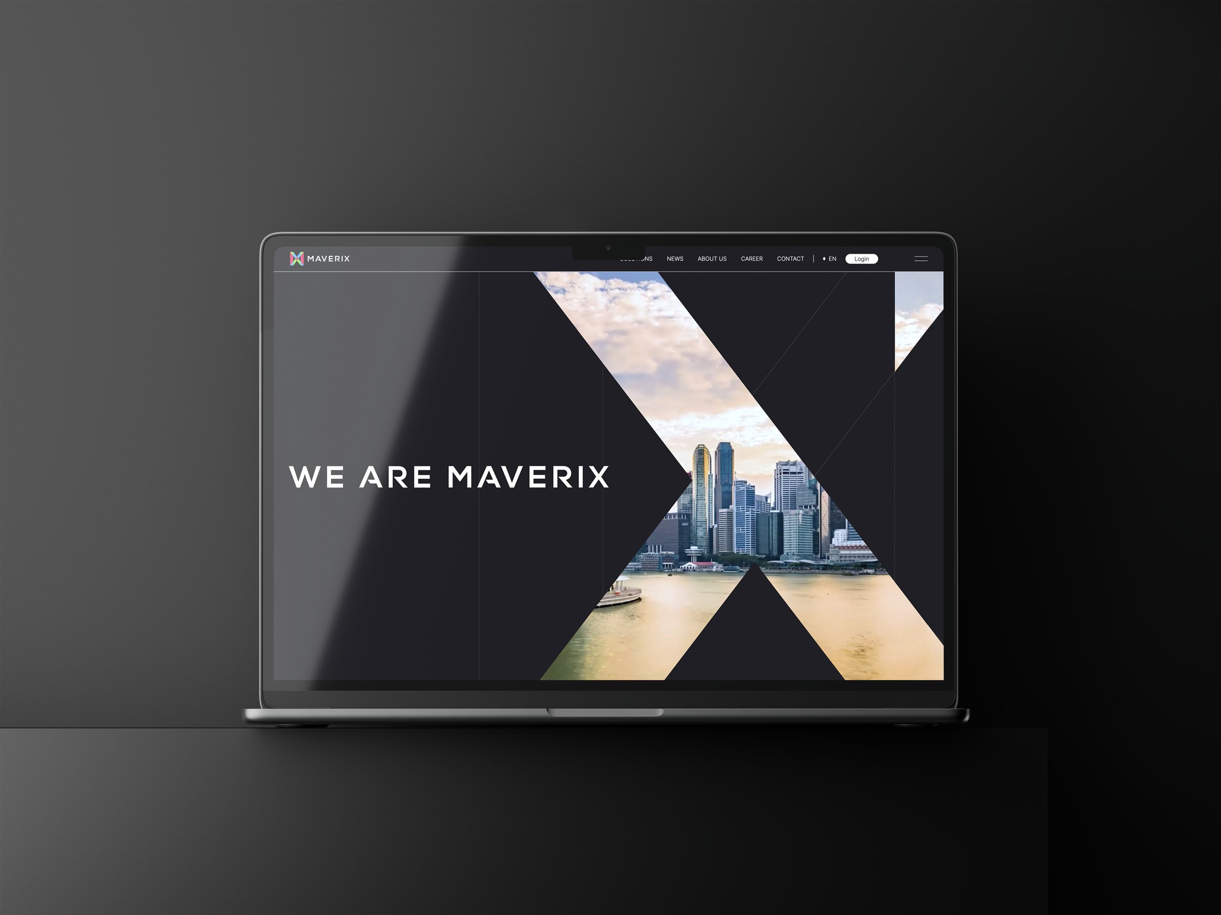
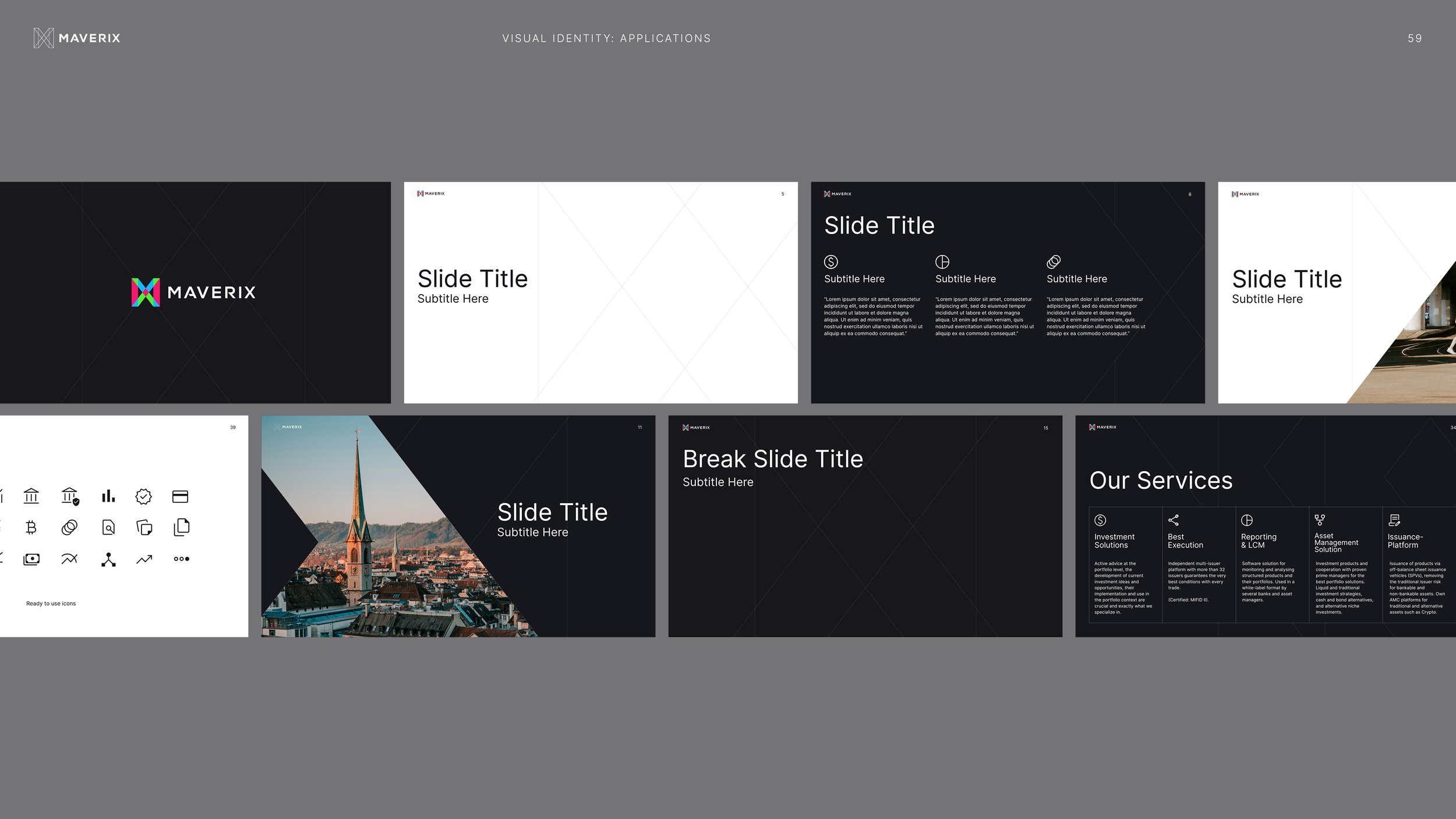
Visual Identity & Brand Guidelines (Crush).
Artwork Assets & Activation Templates.
Messaging & Copywriting.
In-house Design Team Support & Guidance.
Web design & Build (Livingtech)
Context.
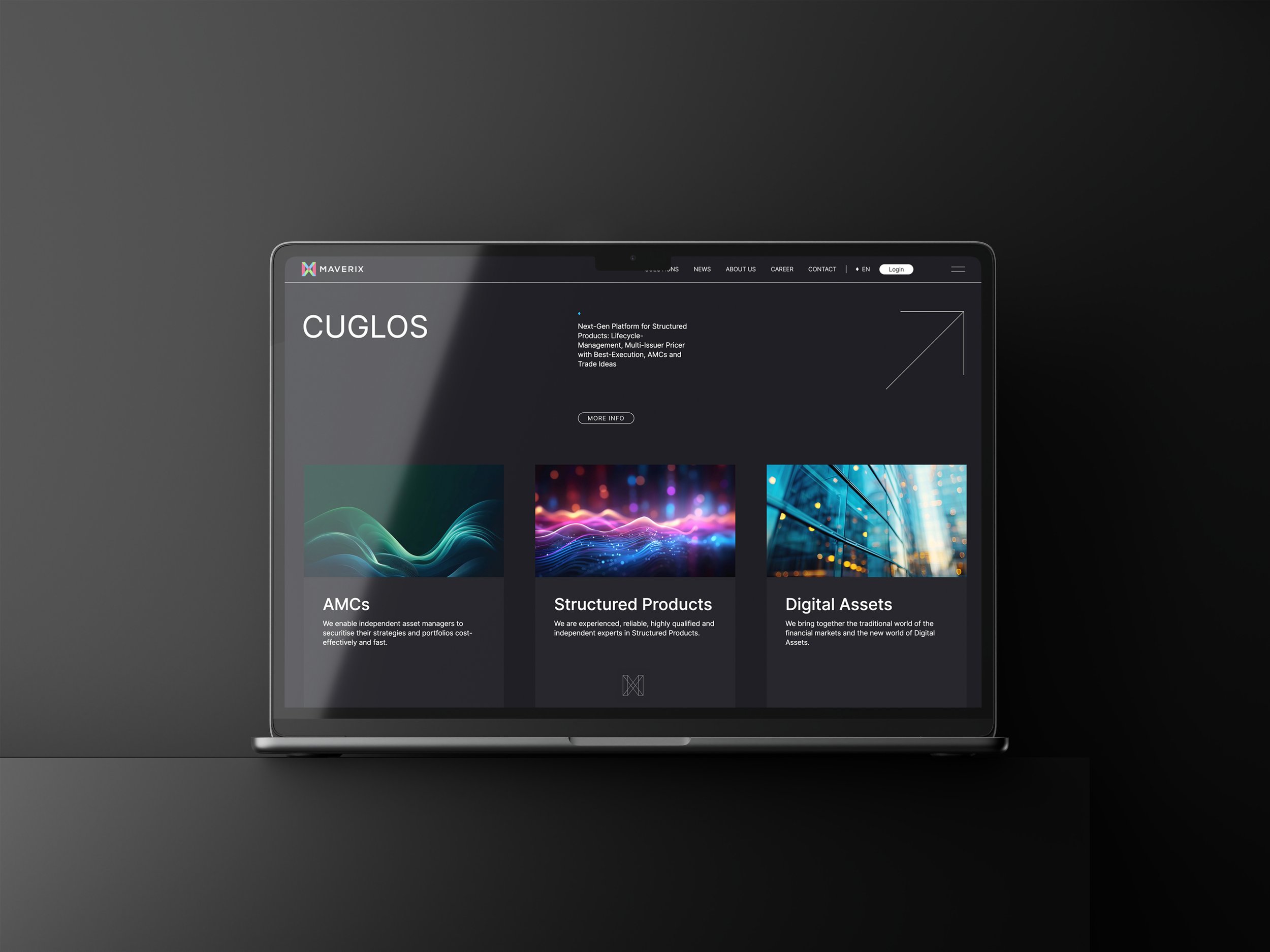
Maverix is the new name for CAT Financial Products, a well-established, super-innovative, Swiss Securities House based in Zurich, Switzerland. 17days was invited to lead a full rebrand to support the re-launch of the company’s services, products, culture and spirit.
The Swiss finance marketplace is a ‘sea of sameness’ - home to undifferentiated brands with little personality or point of view. CAT’s leadership team wanted to break free from this corporate crowd, celebrate their progressive approach, and reconnect with an era when asset management was full of passion, creativity and fun.


Maverix’ True Story.
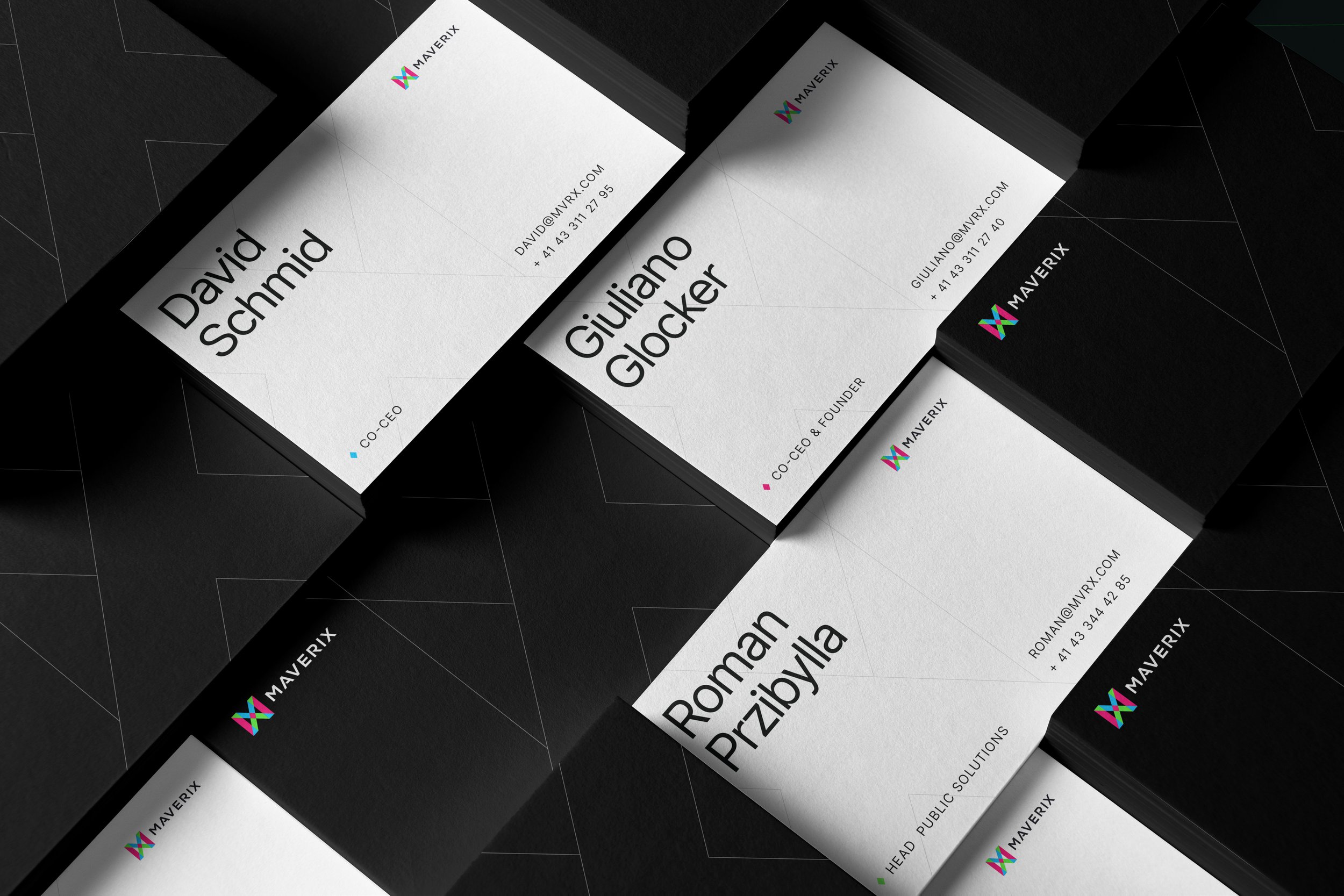
17days led a brand naming journey that explored different dimensions of the value proposition, including the ‘breakaway’ ethos of the business, the innovative products that support the company’s asset and wealth management services, and the fact that everything is devoted to growing value. This journey led us to ‘Maverix’, which captures the maverick culture of the business, and embeds ‘X’ – a simple, global symbol for growth – in the name.
The naming process enabled us to get under the skin of the story we would tell through emotive copywriting and a disruptive, edgy visual identity. The final MX logomark and graphic system won the hearts and minds of the Maverix team. Not only does it capture the story and standout Maverix wanted, but it is easy for the company’s in-house design team to deploy across all touchpoints, from website and social media to printed presentations and flyers.


Impact.
This is a brand identity built with a bold and bright future in mind. Whilst rooted in a very distinctive MX mark and confident, emotive copywriting, it is versatile, playful and easy to deploy across static and moving channels. As Maverix grows and evolves, so will the new brand identity.


